Pop Culture Preservation
We seem to agree that some buildings are worth preserving, but what about big box stores and fast food restaurants?
Welcome to the Quarantine Creatives newsletter, a companion to my podcast of the same name, which explores creativity, art, and big ideas as we continue to live through this pandemic.
If you like what you’re reading, you can subscribe for free to have this newsletter delivered to your inbox on Wednesdays and Sundays:
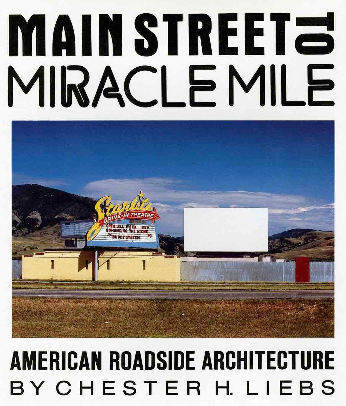
At the recommendation of Addison Del Mastro, who writes The Deleted Scenes newsletter, I recently finished reading an interesting book by Chester H Liebs called Main Street to Miracle Mile.
The book was published in 1985 and attempts to document how urban commerce centers of the late 1800s transformed into suburban sprawl during the age of the automobile. The book also takes a deep dive into the history of many specific features of Americana, including motels, diners, gas stations, grocery stores, miniature golf courses, and drive-in movie theaters.
At the end of the book, Liebs makes the point that the architecture and vernacular of our roadside buildings is also the history of our time, and that many of these structures should be preserved before it’s too late.
It was an interesting way to end the book and an intriguing prompt. After all, so many of our historic Main Streets from the turn of the twentieth century are considered landmarks and are preserved in some way. The tenants may change over the years and are more likely now coffee shops than soda fountains, yet the brick facades remain intact.
Structures built during our modern era of sprawl, which Liebs points out began even prior to World War II but really gained steam in the 1950s, are harder to preserve as they were often purpose-built for one business.
Here in Massachusetts, the iconic Chinese/Polynesian restaurant Kowloon was built in the 1950s with a decidedly South Seas vibe. The building is a local landmark, yet it would be hard to repurpose into anything else should Kowloon ever close. That iconic roof line would be a strange fit for a Lens Crafters location or a Chipotle.
The restaurant is not closing anytime soon, but its owners are ready to evolve it. It currently seats 1,200 people but no longer does the business to support that customer base. There are plans to raze its current home, replacing it with mixed use buildings with apartments above and restaurants and retail below, including a smaller Kowloon that seats 350.
As much as I love that old building, I also haven’t dined there in years and wouldn’t plan to anytime soon. It’s a blast from the past which is comforting to pass in a car, but not to stop for dinner.
Herein lies the challenge with Liebs’s prompt about preserving our roadside architecture: capitalism has a hard time monetizing nostalgia. After all, if your business isn’t constantly evolving, it gets left behind and a competitor takes your customers. We like the comfort of seeing old stuff, we just don’t like to patronize it.
I understand the urge to preserve certain icons of our commercial past, even if they are no longer viable businesses.
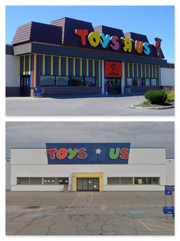
I spent about 5 years working for Toys R Us during my high school and college years and have fond memories of the chain. The first store where I worked was a 1980s style building with a shingled mansard roof, rainbow striped panels surrounding the entrance door, and two images of Geoffrey the Giraffe on the facade. It was the store where I shopped as a kid, then later worked as a teen and it always made me smile.
By the time the store went out of business (long after my tenure there had ended), it looked quite different. There were attempts made at modernizing the facade; removing the mansard, painting the rainbow panels white, and removing any sign of a cartoon giraffe.
These renovations attempted to make the place feel more contemporary, but it also stripped some of the character away from the shop. By the late 2010s, the colorful design and shingled mansard looked dated and needed attention, but the identity of Toys R Us was also a bit in limbo, so the store was made different but not necessarily better.
Of course, minor cosmetic upgrades couldn’t save the retailer, which had a hard time competing with Amazon and Wal-Mart, and was also loaded with debt from being sold to a private equity group. After liquidating the business, Toys R Us attempted a comeback with one location at one mall in New Jersey, but the big box version of the store will likely never be revived. That format no longer matches how we shop.
Even a just announced partnership to bring Toys R Us inside Macy’s stores shows that the brand still has some draw, but it also demonstrates that retailing has changed, and with it, the physical needs of doing business.
Do I wish there was some version of Toys R Us left where I could take my kids, even if it was just a museum? Of course! But I want to take them to the store that I remember, not a Macy’s aisle with some decorative signage.
I’ve written about the challenges of recreating something for nostalgic value, and I’m not sure a Toys R Us museum would ever be worth the effort. Those rainbow panels will just have to live in my memory and camera roll.
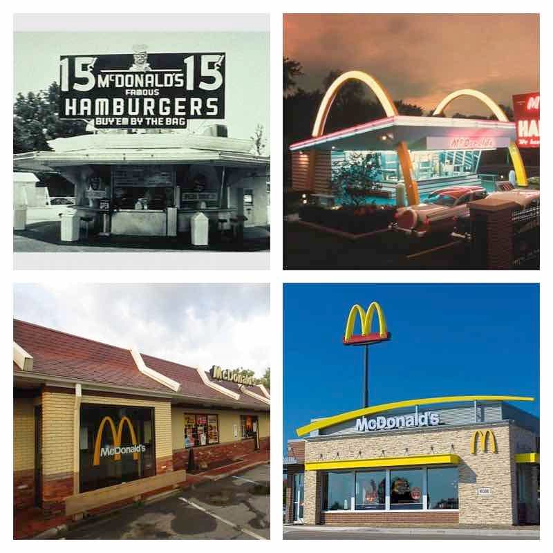
A similar question of what is worth preserving gets raised with a ubiquitous restaurant like McDonald’s. When I was coming of age, McDonald’s (like Toys R Us) had shingled mansard roofs and features like a large dining room (sometimes with an attached playground for kids). It’s the bottom left image below.
This version of the restaurant is the one for which I have the most nostalgia, but it’s also not the original. The top left photo above is the first McDonald’s restaurant, opened in San Bernardino, CA by the McDonald brothers. It may look familiar if you saw the movie The Founder, but it is not what most people picture. The “classic” McDonald’s architecture with the brightly lit Golden Arches (top right frame above) became more iconic and was seemingly everywhere in the 1960s.
As Liebs notes in his book, the modernist architecture that attempted to draw attention from passing motorists, like the neon Golden Arch version of the restaurant, started to fade by the 1960s. It was replaced with a style Liebs calls the Environmental Look. Natural materials like stone and wood were favored in an attempt to blend in with the neighborhood. This was inspired in part by Silent Spring, the book by Rachel Carson which sparked the environmental movement of the 1960s, and it helps explain why McDonald’s, Toys R Us, and many other businesses embraced shingled mansards and stone structures in the 1970s and 1980s.
Of course, most of the McDonald’s of my era have been replaced with the more contemporary design now used (bottom right in the image above). Sometimes this is done through renovating the existing structure, while other times, the old building is demolished and rebuilt. People now prefer drive thrus and curbside pickup to dining in, and the newer style reflects that. However, McDonald’s no longer carries the same clout it once did, in part due to books like Fast Food Nation.
Which of these versions of McDonald’s should be preserved? All of them? None of them? Only those that are older than a certain age (and is that 50 years old, 60 years old, 70 years old)? Were this a Main Street building, the answer would be easy- preserve the building and let the tenants change over time, updating only the sign and window displays. But purpose-built architecture makes this a harder calculus.
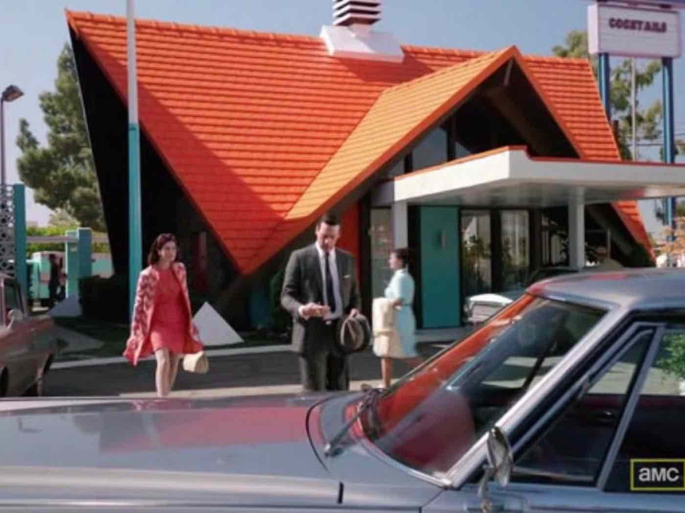
A restaurant which Liebs covers extensively in the book is Howard Johnson’s. I don’t recall ever eating in one, but I have a strange nostalgia for the chain. Maybe it’s because they were headquartered here in Massachusetts and several of the iconic restaurants and motel offices with the orange dormered roofs still remain, albeit not in their original condition.
Howard Johnson’s may be benefiting from a surge in nostalgia lately, but it was hardly in demand over the recent decades. The last remaining Howard Johnson’s restaurant recently closed in New York. Or rather, I should say, reports of the restaurant’s closure were recently published, but its closing happened in January or February, according to The Washington Post. Its closing was so insignificant that it took months for the media to even discover it had occurred, and even then, they couldn’t pinpoint the final day of service.
It was strange to hear of that last restaurant’s passing, although I never would have made the trek out to eat in it, even if it was the last of the iconic chain. In looking at the real estate listing for the property, I see an unremarkable dining room with laminate counters, cheap tables and chairs, and dirty carpet. From the photos of the interior, I bet the food would have been pretty awful too. It’s not how I imagined Howard Johnson’s, but again, I never actually ate there.
Perhaps my memory of Howard Johnson is shaped more by Mad Men, which featured a visit to the restaurant in a season five episode. The combination of a practical former Howard Johnson’s location, production design, and visual effects combined to bring the viewer to a place that never quite was but that still felt familiar. I think the version of Howard Johnson’s that I want to visit is the one where Don Draper ate, with the bright turquoise booths and the shiny orange roof.
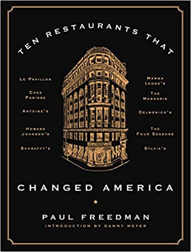
Howard Johnson’s is also profiled in Ten Restaurants That Changed America by Paul Freedman, which I am currently reading. Freedman selected the restaurant to include in his book because it was one of the first ones to insist on standardization so that the experience at one location was similar (though not identical) at another. This was done through cooking items in a central commissary and reheating at the local restaurant, rather than preparing items from scratch. It set the stage for many of the chain restaurants that now dot our landscape. Even though food prep was minimal on site, the quality of food was very high, with Howard Deering Johnson, the founder of the restaurant, developing relationships with suppliers and spending a large proportion of his revenue on food sourcing.
Howard Johnson’s became popular because it offered a dependable, family-friendly meal, conveniently located on major roads at a time when Americans were beginning to explore the country by highway. It began to decline in the 1970s as fast food became the standard roadside fare, but also because it stopped investing in quality ingredients, instead seeking cheaper options that were noticeably inferior. A series of management and ownership changes through the 1980s and 1990s meant further disruptions to the business model, to the point where there were only two restaurants left as of 2015, and none at the moment.
Freedman makes a connection between the decline of Howard Johnson’s a decade ago and McDonald’s struggle against fast casual restaurants today:
At some point around 1970 [at Howard Johnson’s], the multiplication of signature items (ice cream, clams, chicken pot pies, Boston baked beans) stopped being a winning strategy and the fast food chains raced ahead by having a limited menu and faster service.
Now McDonald's and its peers face some of the same difficulties in assuring quality and protecting identity that once plagued Howard Johnson’s in the 1970s… Attempts to diversify its menu have led to slower service and diminished attention to its basic products, such as cheeseburgers and French fries. McDonald's core constituency is thus alienated because the chain is no longer reliable in terms of speed or quality (the French fries are sometimes cold), but expanding menu options has not attracted loyal new customers… The specific complaints against Howard Johnson's in the 1970s and McDonald's in the 2010s might be different, but the perception of blandness, homogeneity, and decline in the core product is similar. What both chains possessed in their best years was the ability to put forward a believable fantasy of ease- a peculiar kind of cheerfulness. When Howard Johnson's lost the image of being a treat, of being fun, it started to lose its way. McDonald's has been able to flourish for a longer time than Howard Johnson's did as a convenience rather than an experience, but it too has lost the sparkling sense of attractive, push-button modernity that the McDonald brothers created in San Bernardino and that Ray Kroc was able to replicate.
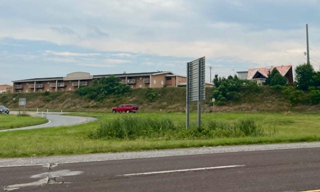
Howard Johnson’s name lives on in the hotel chain, at one time part of the same business as the restaurant and often located next door, though the hotels were long since sold off and are today owned by Wyndham. I love spotting the iconic roof lines as I drive (this one was not far from the former Days Inn I wrote about last week), imagining what once was.
In capitalism, in architecture, and in life, we are always seeking what’s new. Things grow stale and require reinvention to continue to thrive. I’m not sure what I would prefer- a Howard Johnson’s that evolved with the times but that meant tearing down the older buildings (like Kowloon is trying to do or like McDonald’s has done at countless locations) or a chain that belongs firmly in the past but leaves us little bread crumbs of what once was.
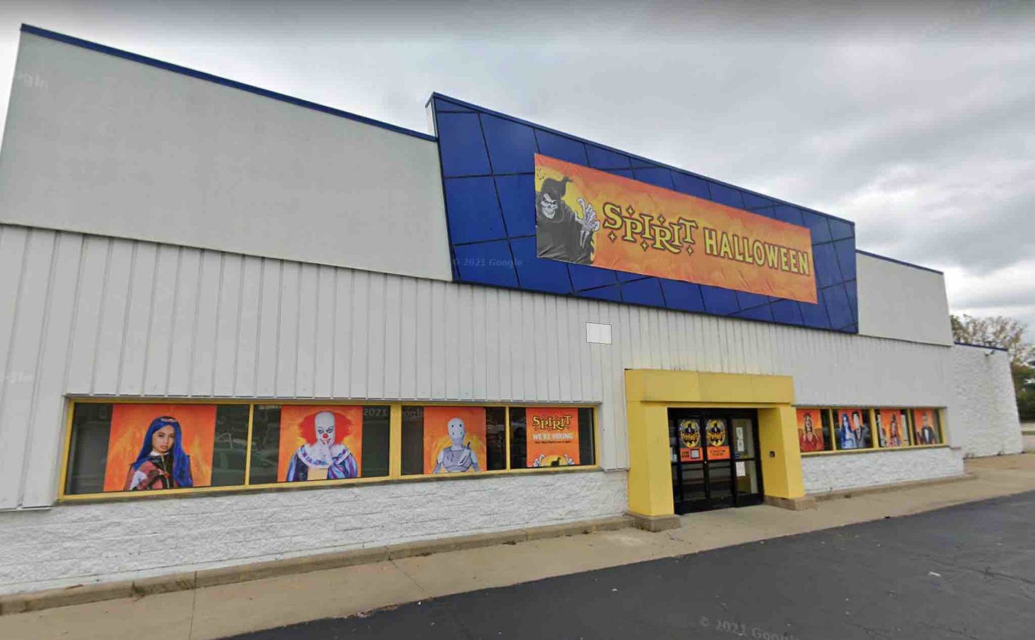
As for my Toys R Us location, it appears to still be vacant five years after closing, with some usage happening in the fall, according to this Google Street View screen shot:
The fate of the site of my first job is similar to that of Circuit City, Pier 1 Imports, and Borders Books- a popup Halloween shop for a few months, then empty most of the year. In my opinion, these former icons of American retailing should be torn down and repurposed as something else, the window to preserve the past long since closed.
No matter how you personally feel about roadside and suburban architecture, it is emblematic of a certain period of American growth and culture. These buildings are where we shopped, ate, and recreated for a solid 50 years. The impulse to look back is strong, but so is the human urge to move forward. I wonder if there’s a way those can happen hand in hand?
Related Reading
If you’d like to catch up on past episodes of the Quarantine Creatives podcast, they can be found on Apple Podcasts, Spotify, or wherever you listen.
Please consider sharing this with a friend that you think might enjoy it, or better yet, share it on social media so you can tell hundreds of friends!
If you’ve missed past issues of this newsletter, they are available to read here.
Stay Safe!
Heath
Thanks for reading Quarantine Creatives Newsletter! Subscribe for free to receive new posts and support my work.


