Welcome to another edition of Willoughby Hills!
This newsletter explores topics like history, culture, work, urbanism, transportation, travel, agriculture, self-sufficiency, and more.
If you like what you’re reading, you can sign up for a free subscription to have this newsletter delivered to your inbox every Wednesday and Sunday and get my latest podcast episodes:
Have you ever noticed that everywhere kind of looks the same these days?
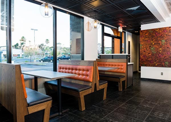
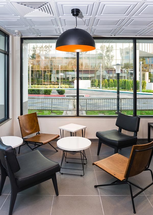
Here are a few interior photos of some spaces that I recently saw published online:
Can you tell what brand is pictured?
Can you even tell what type of business this is?
You might think you’re looking at photos from a hotel lobby, a new corporate campus for office workers, or maybe a new student union on a college campus.
But these photos are actually from new prototype restaurants that Taco Bell opened in California and each photo above is supposed to represent a completely distinct approach. They are so proud of these new designs that they have dedicated an entire blog post to them on their corporate website, which includes this passage:
“…they’ll probably be on your list of Taco Bells to visit as soon as humanly possible. Trust us, they’re cool. While each of the four designs has a different look and feel, they all truly express the Taco Bell you’ve grown to know and love.”
Now granted, it’s been a long time since I was a regular consumer of fast food, and an even longer time since I was a regular consumer of Taco Bell, but this is not exactly the Taco Bell that I’ve “grown to know and love.” For me, the photo below (and the many more in Rolando Pujuol’s great article about Taco Bell for
) better sums up how I remember Taco Bell: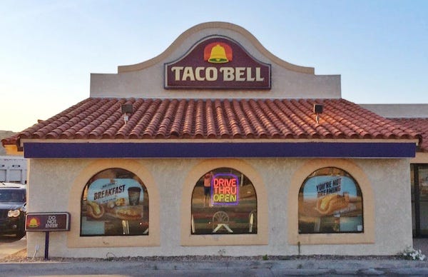
I suppose you can quibble with whether or not Taco Bell serves “real” Mexican food, but there’s no denying that a stuccoed mission building with a clay tile roof certainly evokes a unique feeling. It would be hard to imagine ordering a hamburger from this building.
As I mentioned on Wednesday, we spent some time last weekend driving a section of Route 1 through Central New Jersey. Route 1 was once the main North-South highway on the East Coast, connecting Maine to Key West and running through most major cities along the sea. These days, it’s often more of a commercial hub, dotted with suburban shopping centers and fast food chains (it’s where the “fishing village” Christmas Tree Shops, the Hilltop Steakhouse neon sign, and Kowloon are located here in Massachusetts).
As we drove through New Jersey, I noticed several new fast food restaurants under construction which all seemed to be variations on the same architectural theme- a large rectangle with several other rectangles stuck on the side. Without signage or a particular color scheme, it was nearly impossible to distinguish one chain from another.
Maybe I’m just being nostalgic, but I liked back in the day when a restaurant building was clearly one thing and one thing alone.
In my hometown of Willoughby, Ohio, there used to be a Wendy’s directly across from the municipal swimming pool. It closed when I was very young, and the former Wendy’s became a veterinarian’s office where we used to take our cat.
When my parent’s mentioned it was a former Wendy’s, I couldn’t unsee it. The side entry vestibule, the brick walls, the U-shaped asphalt parking lot, even the bricked over drive through window screamed Wendy’s. It’s been more than 30 years since once could order a Frosty and fries at this address, yet even today, the building looks like a Wendy’s!
Down the street from the veterinary clinic is a building that used to be a Friendly’s. We would go there to eat ice cream on my birthday. When it closed in the mid 1990s, it was renovated into an office building that was known for many years as the Friendly Professional Building. In Willoughby, like in a lot of small towns, places are known more for what used to be there than for what is there currently. The building still stands, but the Friendly label has since been dropped, although I always liked that nod to the past.
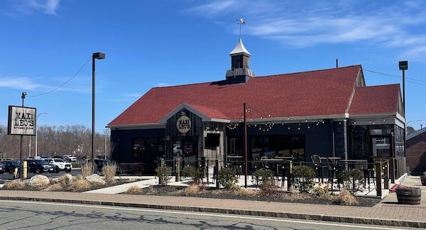
Friendly’s filed for bankruptcy in 2011 and abruptly closed 63 stores overnight, followed by another round of 23 closures in 2019, so there are now plenty of vacant stores with the distinctive cupola that are being reused for a variety of businesses. Here’s an example from Chelmsford, MA, where a former Friendly’s is now a location for local pizza restaurant Max and Leo’s.
In Billerica, MA, a former Friendly’s is now an urgent care center.
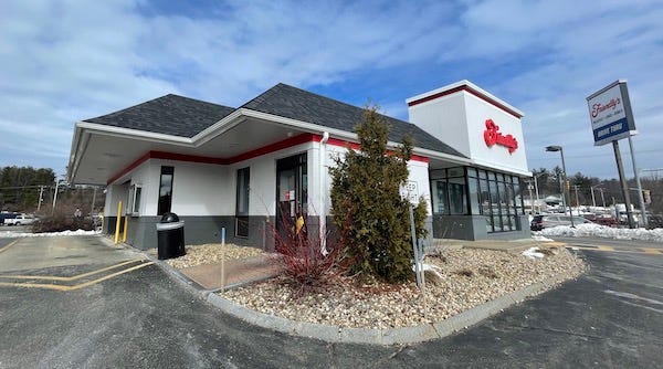
Ironically, one of the Friendly’s in this area that’s still in operation looks nothing like these other stores. The location in Merrimack, New Hampshire opened in 2017 (the chain’s first new location in nearly 10 years), but rather than build a new structure, the ice cream restaurant opened in a former mansard McDonald’s, with some slight modifications to make it look a little more distinct.
It may seem strange that a chain like Friendly’s, which is almost as well known for the architecture of its locations as it is for its food, would opt to open a new outlet in a store that looks nothing like the others, but I appreciate that they were willing to renovate and update an old McDonald’s location.
More often, it seems that a new location is constructed from scratch while a vacant building sits nearby. I could possibly see justifying this if each new building were distinctive and striking, but is that effort really needed when we just keep creating slightly varied versions of the same rectangle?
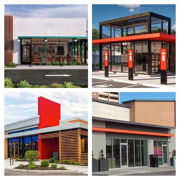
To make this point, here are four modern restaurant buildings from national chains with the branding removed in Photoshop. Can you tell what’s what here?
I have a lot of quibbles with how fast food affects our diets and how our food is grown, processed, and sold which are outside the scope of this post (although I’ve written about it before). Suffice it to say, do we really need to add to the societal costs of these places by building more of them from scratch on virgin sites when we could simply retrofit something existing. If the architecture isn’t particularly unique and doesn’t communicate much about the food inside, why is so much effort put into making each restaurant look “modern?”
The strange thing to me is that in writing this, I feel like an old man complaining about how things were better in my day and degrading that which is more modern. I realize that there are kids growing up now that may one day have nostalgia for these identical boxes with slightly varied panels of wood and color.
Or maybe we’ll get to a point where we realize that a box is just a box, and if there’s a good one down the street, we can use that one and make it what we want, rather than build something new just because. Or maybe these boxes will prove to be uniquely qualified for retrofits and when they are eventually converted to veterinarian clinics, urgent cares, or other restaurants, there will be no artifacts of their former lives visible. Only time will tell.
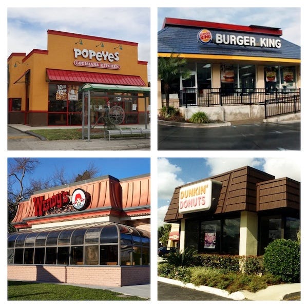
By the way, if you’re wondering what those generic boxes above are, here’s what those stores look like in their more “classic” incarnations. Maybe they didn’t look all that distinct from each other back in the day either and I’m choosing to view history more favorably than the present. Strip the signage and repaint the facades and you might be hard pressed to tell what’s what below too.
Do you prefer the classic look of fast food or the more modern version? Have you seen a particularly well done (or a particularly poorly done) retrofit near you? I’d love to hear from you in the comments!
Thanks for reading Willoughby Hills! Subscribe for free to receive new posts and support my work.
Related Reading
Pay What You Call For and Drink What You Please
If you’ve missed past issues of this newsletter, they are available to read here.





There's a disconnect between corporate marketing & customer preference. I was talking w/ someone recently about this re: branding. Taco Bell, for example. It's not a 3rd Place for lingering, so it's silly to set up a living room vibe. People eating their Taco Bell are in a hurry to consume that stuff without spilling all over their laps. It's a lean-over-the-table and move-along spot. The marketing grads at corporate aren't paid to think of customer preference, they're paid to help corporate conform (i.e. "stay relevant").
Also, did you say Taco Bell has a blog?!?!
Our family business was in Painesville, and every once in a while Dad would take us to the Friendly's in Willoughby.